The first problem I ran into was consistency between images. I started with my camera set to Auto White Balance. This created slight differences in light color between images. To achieve color consistency between images, I used my X-Rite ColorChecker Passport in a test image. I then used Lightroom to determine the White Balance setting of my lighting set up, which turned out to be 3200K. I set the manual white balance on my camera to 3200K and, viola, consistent white balance between images.
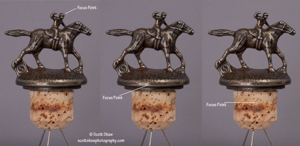
With the front of my lens less than one foot from the stoppers, depth of field became the next issue requiring attention. If I focused on the jockey’s head, the focus on the front edge of the stopper and the cork would appear soft. So no matter which of those three points I focused on, the other two appear soft.
To address the depth-of-field issue, I took three images of each stopper. Using manual focus, the first image focused on the jockey’s head. The second image focused on the front edge of the stopper. The final image focused on the front of the cork. Click on the image above to enlarge it and look at the three focus points and then look at the other two points to see this softness. It is not much, but it does make a difference.
Once I made the three images I brought them all into Photoshop and used the stacked focus feature to create a single image with all three areas sharp.


