

Candy Cane Christmas Light Text (Click for larger image)
My wife planned a Disneyworld trip to see the Christmas lights they put up every year. She also insisted that I put together a vacation poster like those I have done in the past. To change it up a little, I wanted to make the text at the bottom of the poster more “Christmasy”. Now, what says Christmas more than a string of lights and candy canes? So I did some googling to see how to photoshop Christmas lights and candy canes.
First off, I found a GREAT youtube tutorial by Keeling Design & Media that walks you through the process to hang a strand of Christmas lights on letters (they also have a nice tutorial on making rope lights). However, the light bulbs used in the Keeling Design video are pretty basic. Instead of using the Keeling Design lights, I drew mine using a tutorial by Buckle Up Studios. The Buckle Up lights look just like the ones my parents used to hang on our tree way back in the day (tutorial here).
While searching for Christmas light tutorials, I ran across another tutorial on making candy cane letters by Ice Flow Studios (tutorial here). Combine the three tutorials and you get the image above. Once you work through the process the first time, it is very simple to spell out anything you need.
My wife is very excited to see the finished project.

We recently returned from an extended vacation in Nova Scotia. While driving around looking at numerous lighthouses, we followed several scenic routes as shown on various Nova Scotia websites and in the map we used. Signs like those above were scattered along each route, and I immediately thought they would make a nice element in our traditional vacation poster.
Unfortunately, I could not get a good set of images of all of the signs. The light was never right, some were rusted, some had holes in them, some were faded. Instead of trying to edit a bunch of borderline images, I first searched the web for the signs. Nope, I never found a crisp set of signs. As a result, I decided to draw my own set using Photoshop.
I started by scanning very small images of each sign from my lighthouse guidebook. I then enlarged these in Photoshop. Not surprisingly, this resulted in images with very poor resolution. However, the resolution was more than adequate for using the Pen tool to trace around all of the shapes and letters to create a nice set of signs.
I have all of these signs in Photoshop psd files. If you need them for a project of your own, I am happy to share!

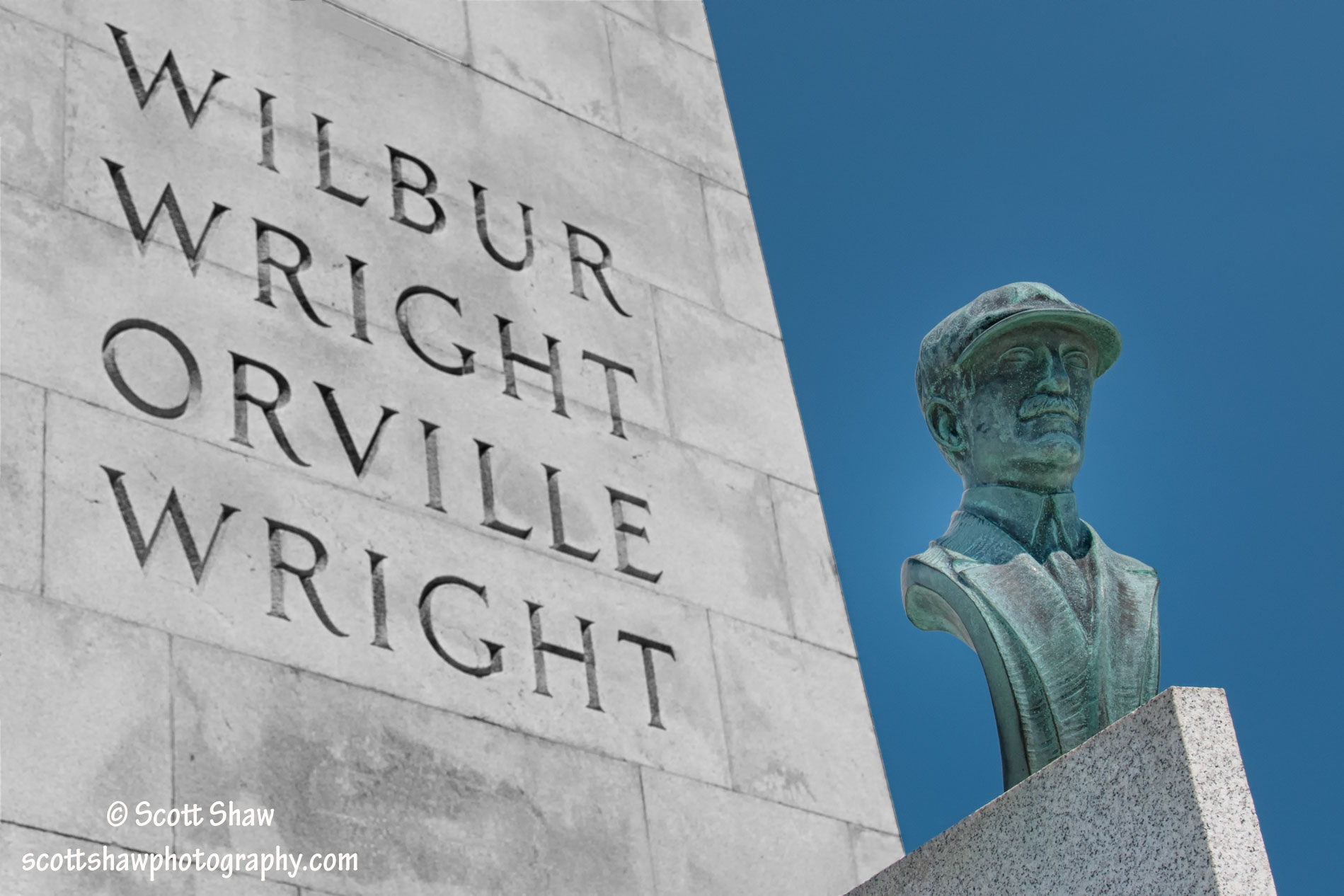
Wright Brothers Monument (click to enlarge)
Above is an original image of a small part of the Wright Brothers Monument in Kill Devil Hills, NC. A quick glance shows that there is just so much wrong with this image. First off, note all of the “dead” space above the text that reads Wilbur. The empty stones and sky add nothing to the image. Also note what appears to be three air vents in the stonework, these just distract the eye. Finally, notice the cut off text along the bottom edge.
Below is the finished image. Cropping the image got rid of one air vent, the dead space above Wilbur, and the cut off text at the bottom. Photoshop’s Content Aware fill feature got rid of the two remaining air vents. The middle air vent in the original image was particularly troublesome. I just could not get that seam between the stones to look right after filling in the air vent. I ended up copying the seam just to the left and using that over the top edge of the air vent (this is the horizontalish seam intersecting the top edge of the image between the I and L in Wilbur).
Another adjustment was the selective use of black and white. I selected just the monument and opened the image in Nik Software’s Silver Efex Pro 2. I converted the monument to black and white and saved the image back to Photoshop. I was looking for that Wizard of Oz transition from black and white to color. Once the Wright Brothers flew their first flight, it was like they touched down in a completely new world, just like Dorothy landing on the Wicked Witch.
Wright Brothers Monument (click to enlarge)
Now, there are two things that I would change about the modified image. First, some clouds would make that plain blue sky much more interesting. Having no control over the weather, I was stuck with with the image I had. Second, notice that in the original image the bust is in deep shadows. My wife recently had hip surgery, so she was not up to climbing the hill to the monument. I went up the hill with only my camera and tripod for a quick look. I wish I had also brought my Cowboy Studios reflector so that I could have lit up the bust. I was able to lighten it somewhat in Photoshop, but using the reflector in the original image would be so much better.
Lesson learned, always carry all tools of the trade, even if you are just planning to take a quick look.
Location: N36 00 50.90 W075 40 02.43
